Palace Coffee’s 43-square-meter Melbourne bar turns its narrow laneway frontage into part of the customer experience, with a sculptural counter and standing service.
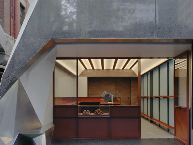
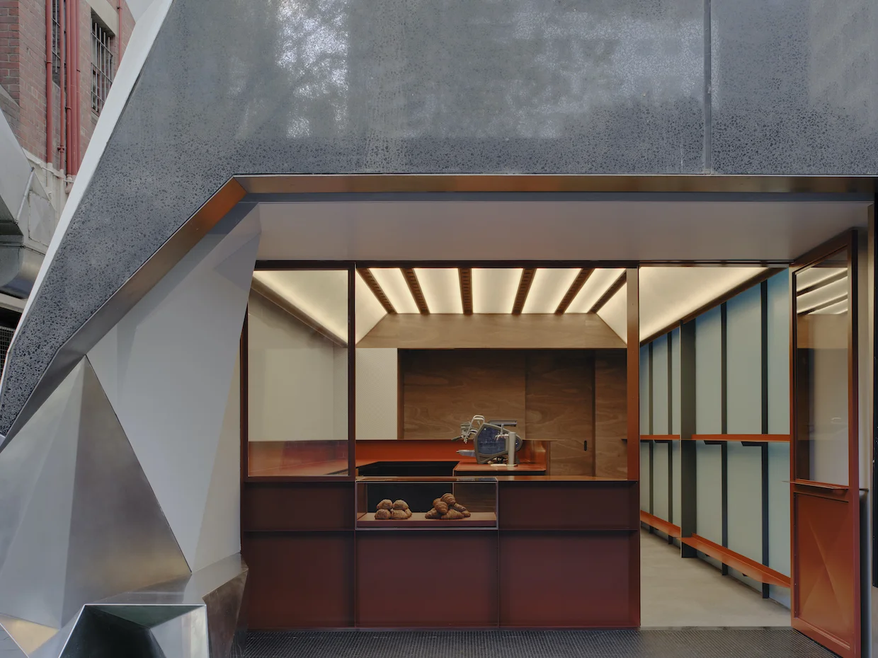
At Palace Coffee, the queue is part of the architecture. A recessed entrance gives customers room to gather in a narrow Melbourne lane, making the act of waiting visible from the street and drawing passersby toward the espresso bar. Many shops treat a line as a problem to manage. Palace treats it as a sign, and that's a more interesting choice than it first appears.
A small footprint built around the lane
Completed in 2024, the 43-square-meter shop sits at the base of Monaco House at 22 Ridgway Place, facing the imposing brick wall of the Melbourne Club. Designed by Kerry Kounnapis Architecture Practice (KKAP), it has no seats: service is quick, and customers either stand inside or wait in the recessed frontage. Forty-three square meters is tiny by any measure, and the no-seating decision follows from that math. A format like this only works when the operation is tight and the customer knows what they want before reaching the front.
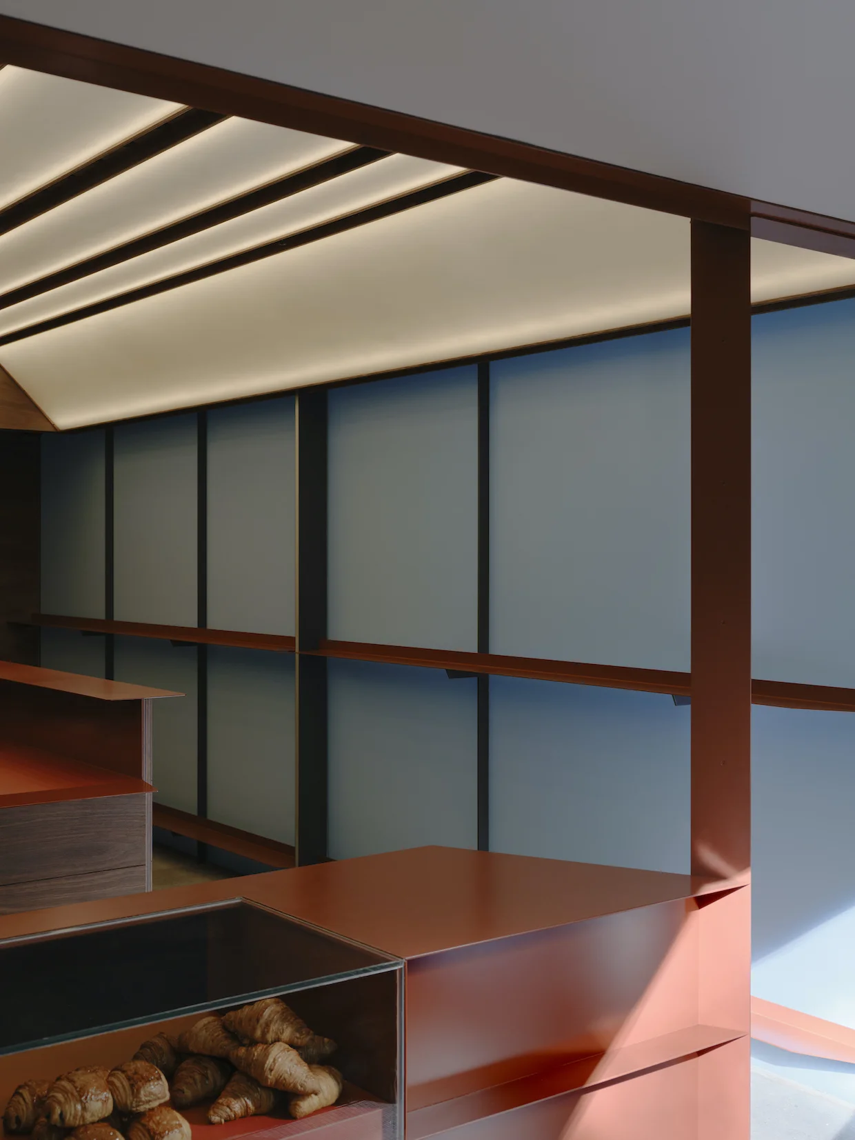
The setback creates a threshold between the lane and the interior, and the queue becomes a visible signal of activity. “The people waiting become the symbol for passers-by, to capture their curiosity and lure them towards Palace Coffee,” KKAP said. “The spaces bleed into one another, supercharging the laneway with people.” I'd argue that's the most honest line in the whole design brief. The architects aren't pretending the crowd is incidental. They're treating it as material, and a crowd is free signage only if the room is shaped to show it off.
Palace operates on weekdays, serving nearby workers during the standard office day. The operators previously founded Burnside Coffee in Fitzroy; at Palace, the compact format carries forward an emphasis on familiar, repeat service. KKAP says the shop serves hundreds of cups daily. That weekday schedule is a real constraint. A shop that closes when the office does depends on a predictable crowd, so the design has to absorb the morning rush without a single spare seat to hide behind. And yet the format seems built for exactly that pressure.
The counter does double duty
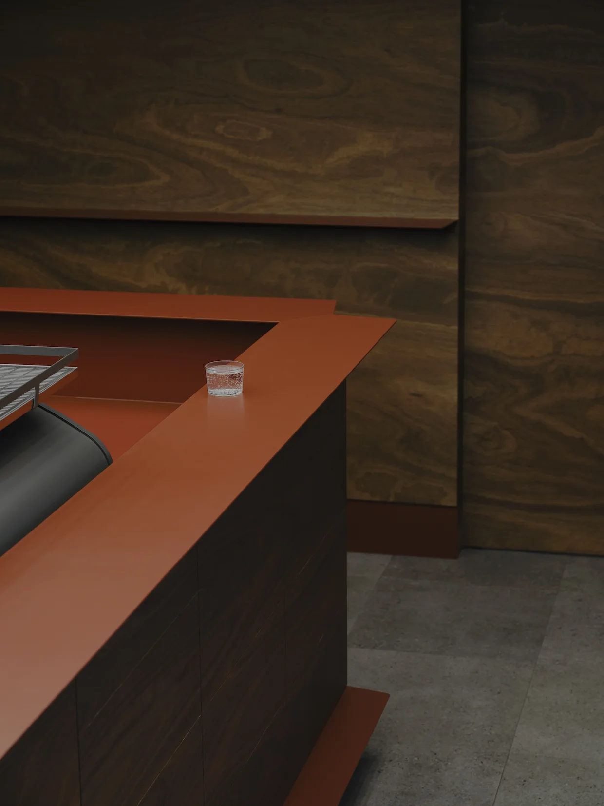
The sculptural serving window works as both facade and workstation. A pastry vitrine marks the takeaway point, while sliding glass doors open a broad connection between staff and customers. Here's the thing: a single element doing two jobs is harder to pull off than it sounds. A counter that faces the street has to look good from outside and work hard from inside, and those demands usually pull in opposite directions. Sliding glass doors are a practical answer, since they can widen the connection when the bar needs air.
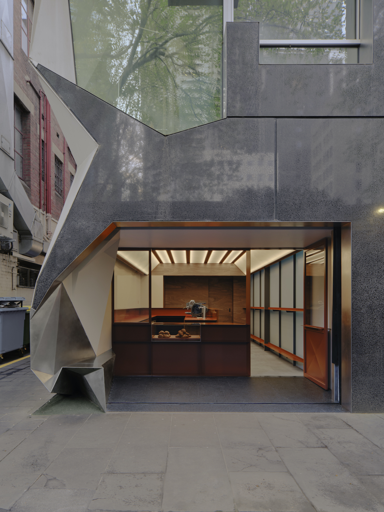
KKAP describes the bench as “detailed like a Donald Judd sculpture,” with a continuous surface spanning inside and outside. Judd's work, known for industrial materials and strict geometry, is a demanding reference for a café counter. The comparison signals that the bench is meant to be looked at as much as used. That's a bold claim for a surface that also has to take a steady stream of cups, milk jugs and card payments. Pitched too far toward art, a counter starts to feel precious. Pitched too far toward utility, it looks like everything else.
Customers drinking on site receive coffee at higher counters, with sparkling water; a footrest supports the familiar lean-and-sip posture of Milanese espresso bars. Standing-height ledges are a common answer to a no-seating plan, giving people somewhere to rest a cup without the commitment of a chair. The footrest is the detail I'd single out. It acknowledges how many people actually drink espresso, which is standing up, quickly, with one foot on something.
Melbourne references, tailored for Palace
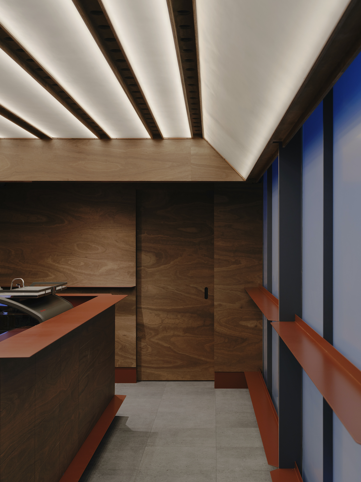
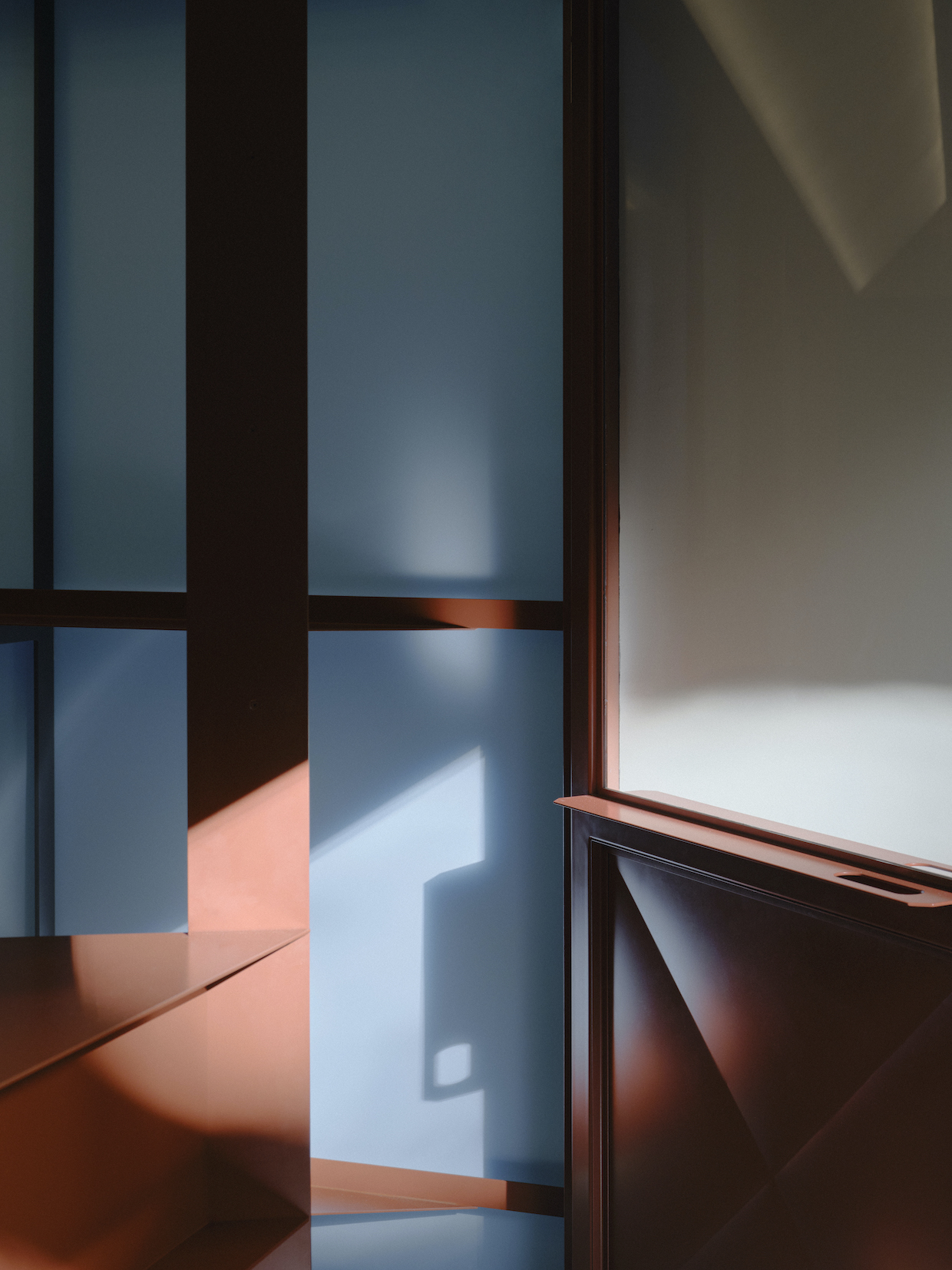
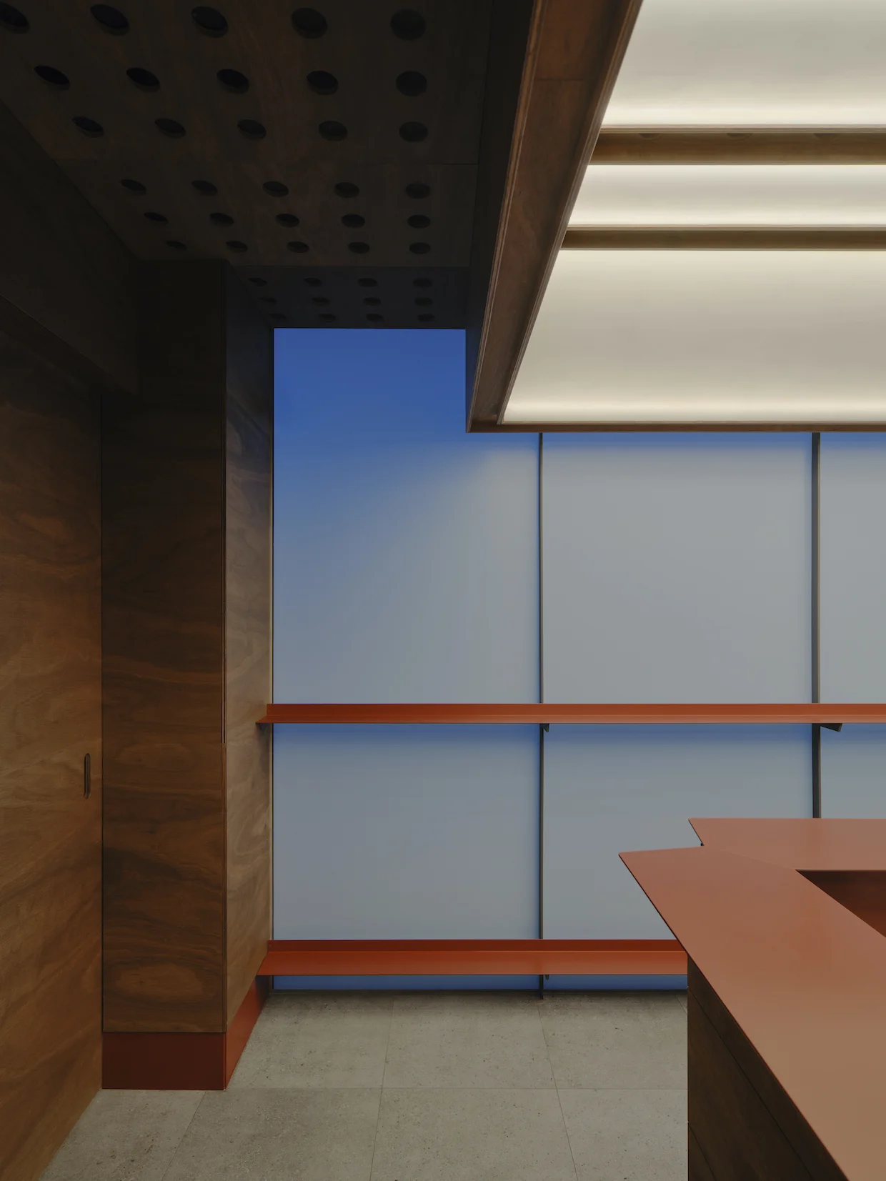
Oxide-red steel and spotted gum timber nod to Pellegrini’s Espresso Bar. A backlit fiberglass ceiling recalls the arcade of the Nicholas Building, while a powder-blue wall gives the shop its own accent. Referencing local institutions is a common move for Melbourne projects, and it works because locals notice when a shop looks like it belongs on their street. The risk is pastiche, where a room becomes a costume. Palace avoids that by borrowing a few specific materials and forms rather than copying an entire interior.
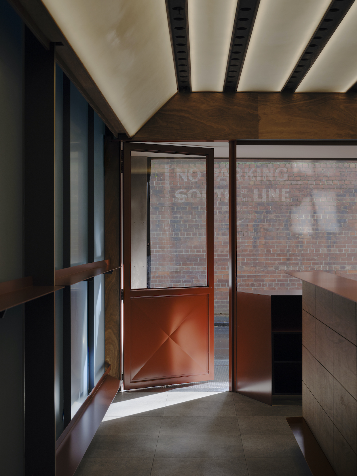
Perforated spotted-gum strips shape the ceiling while concealing building services; the illuminated fiberglass above softens the interior. Hiding mechanical and electrical runs behind a timber ceiling is an old trick, but it only works when the perforation is considered. Here the ceiling does two jobs at once: it hides the clutter and diffuses the light. KKAP says the built forms draw on the everyday familiarity of an unfolded box, matching the practical rhythm of a small, high-turnover bar. A room this size doesn't have space for decoration that fails to earn its keep.
That rhythm depends on recognition as much as layout. KKAP says staff are likely to remember a regular’s name and order by the third visit, describing that familiarity as the basis of hospitality and community. Recognition is cheap to provide and surprisingly hard to design for. (and this is the part most people overlook) the counter, the stools and the sightlines all either help or hinder a barista learning a face. Palace’s architecture supports those brief, repeated encounters by putting the counter, the customer and the lane in close view.
What this means if you're building a small shop
If you're working in this space, Palace is a useful case because it solves a constraint rather than fighting it. A small footprint, no seats and a busy lane are limits many operators would read as failures. The design treats them as the brief. That's a different mindset from squeezing a conventional café into a tight room and hoping the coffee carries it.
The broader point is that layout can do marketing work. A line visible from the street sells the shop before a single drink is poured, and the threshold between sidewalk and counter becomes the first thing a passerby evaluates. What this means for you, whether you run a café or design one, is that the front edge of the building is part of the product. The interior is where the coffee gets made. The threshold is where the decision to buy actually happens.
I'm skeptical of any project that claims a small room can do everything. The source doesn't offer throughput figures, sales data or customer feedback, so I can't tell you how well this design performs day to day. What it does show is intent, and intent is easier to read than results. And yet intent is where most good design starts, and Palace's choices are specific enough to be worth copying in principle, even if the exact details won't travel. Not every corner has a recessed frontage to work with, and that's the real limit on this approach. Where the site allows it, though, the lesson is clear: let the queue be seen.


Discussion
Sign in to join the discussion.